12 Donation Page Examples & Tips for Boosting Conversions

A donation page is an online form on a nonprofit’s website that supporters can use to contribute funds to the organization’s mission.
Donation pages provide a low-effort, high-impact way to contribute—any supporter with a computer, mobile device, or access to the internet can give from the comfort of their home.
In this comprehensive guide, we’ll explore everything you need to know to make your nonprofit’s donation form an effective fundraising tool. Here’s what we’ll cover:
- How to create a donation page
- Donation page best practices
- 12 best nonprofit donation page examples for inspiration
- How Qgiv + Bloomerang helps build high-converting donation pages
According to the M+R Benchmarks 2025 report, the average main donation page conversion rate for desktop users was 11% and 8% for mobile users. This guide’s strategies and examples are intended to help you raise your conversion rate higher than this number to drive greater revenue for your mission.
How to create a donation page
Nonprofits typically create donation pages with the help of an online fundraising platform. These solutions offer tools for developing customized pages, including templates and best practices. Then, organizations can embed these pages into their websites and share the link to the page via other platforms like email and social media.
Follow these specific steps to build your nonprofit’s donation page from the ground up:
- Choose a robust fundraising platform. Fundraising software simplifies the donation page creation process and allows you to easily integrate your donation page into your current fundraising strategies and website. Search for a robust fundraising platform, like Bloomerang, that offers features such as mobile-responsive donation pages, donation analytics, and donor portals.
- Connect your donation page to your CRM. Your CRM or donor management system is your nonprofit’s central hub for storing donor information. When donors give via your online donation page, ensure information like their names, email addresses, and gift amounts automatically flows to your CRM.
- Consider whether to make the form one page or multi-step. Making your donation form multiple pages can actually make the form feel faster to complete. That’s because donors can complete the form in smaller, manageable steps rather than being overwhelmed by the full page all at once. Consider which style might work best for your donor audience.
- Brand your donation page to your organization. Your nonprofit’s website and marketing materials probably have a specific “look” to them. These resources leverage specific colors, fonts, and even tones to convey your organization’s brand. When you include your organization’s recognizable branding on your donation page, it creates a sense of consistency and trust among your supporters who navigate to that page.
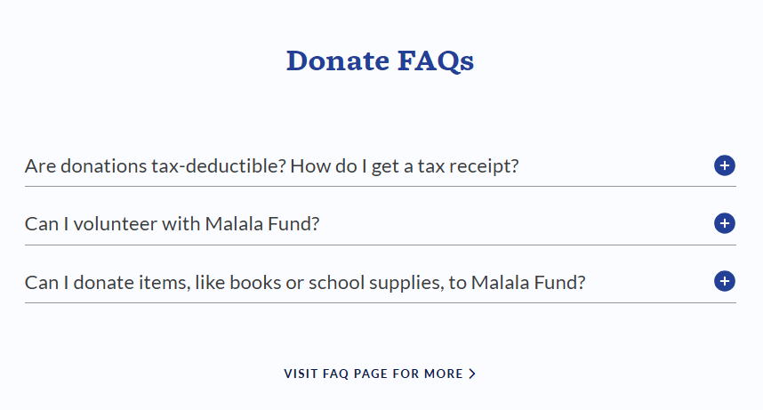
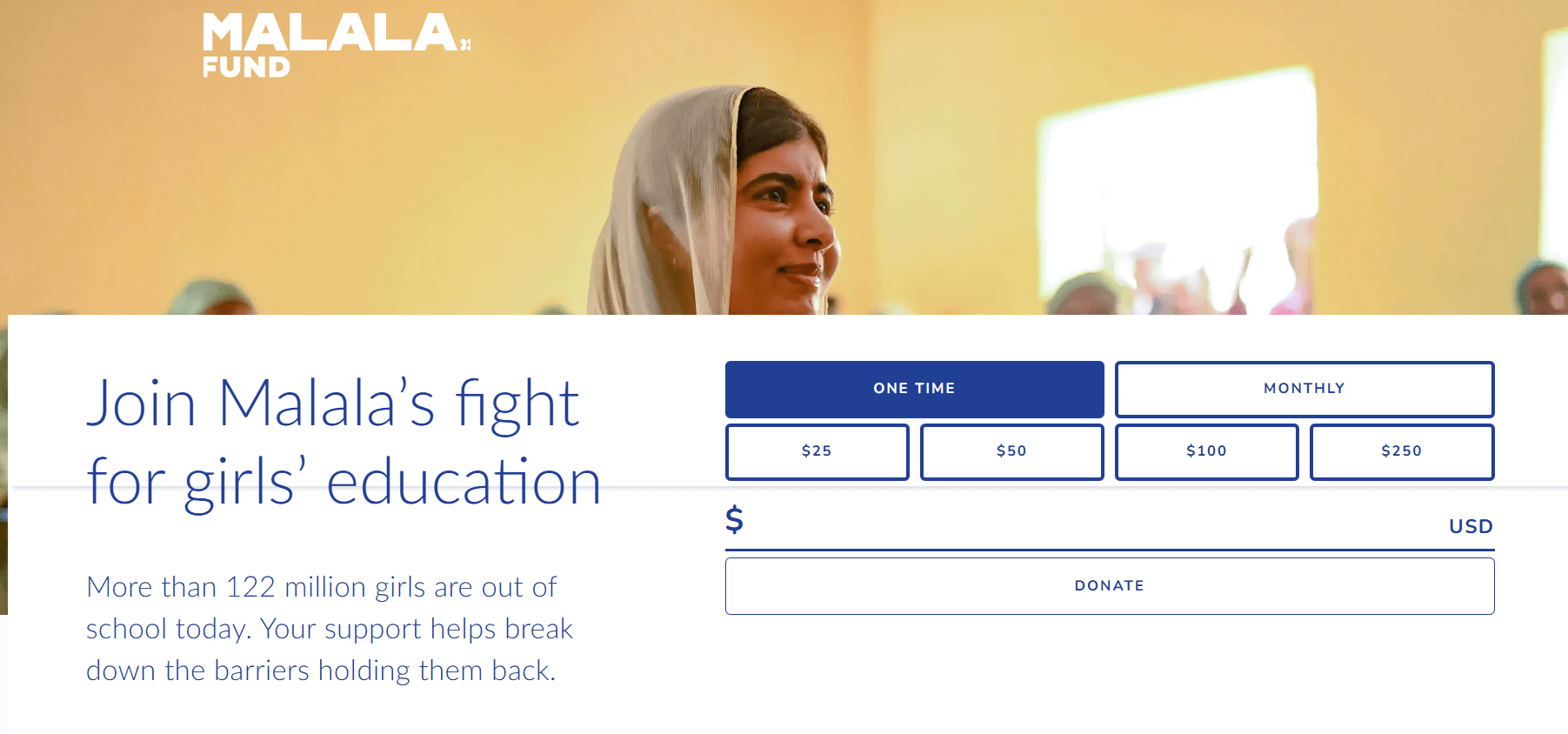
- Answer donors’ FAQs. Some donors may want more information about how the giving process works, the steps your nonprofit takes to use donations wisely, and how your team keeps donor information safe. Consider adding a sidebar to your donation form with a short list of frequently asked questions. These FAQs could include “Is my gift tax-deductible?” or “What will happen to my donation?” Check out the FAQS on the Malala Fund donation page pictured below for inspiration:
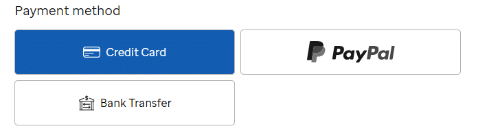
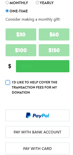
- Set up multiple payment methods. These days, donors expect to be able to give using the payment method that’s most convenient for them. Fundraising statistics show that when it comes to online giving, 63% of donors prefer to give online with a credit or debit card, 10% like PayPal, 5% would use a wire transfer, and 1% prefer a digital wallet like Apple Pay or Google Pay.
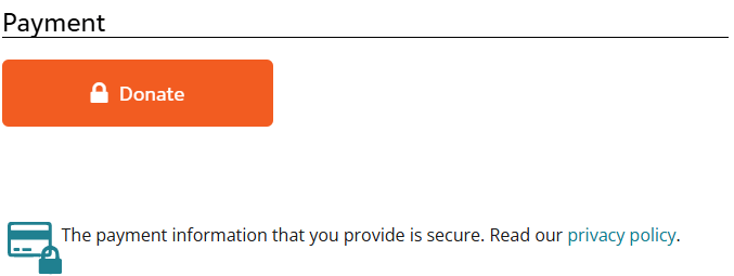
- Ensure your submit button stands out. The donate button at the end of your donation page is the most important call to action (CTA) on your giving form. This button enables donors to actually submit their gifts. Make your donation button stand out using vibrant colors, a bold font, and strong color contrast. For example, check out the submit button on the Glacier National Park Conservancy page—it stands out with a bold orange color, and it includes a lock icon so donors know their gifts are secure.
- Optimize the confirmation page. Once your supporters have filled out your donation page and submitted their gifts to your organization, their interaction with your organization isn’t over. You can continue their engagement by providing more value on the confirmation page. Link to your volunteer page, event calendar, social media pages, and email newsletter signup to provide multiple ways for new donors to stay in touch.
An online donation page captures supporters’ attention at the peak of their engagement with your organization, providing an immediate way for them to get involved with your mission. When you design your page thoughtfully, you can meet donors where they are to inspire more donations and lay the foundation for future engagement.
Donation page best practices
Your donation page should capture your supporters’ attention. It’s the crucial step to beginning a long-term relationship with a new supporter and a crucial engagement opportunity for your existing supporters. Follow these donation page best practices to get more from your page:
- Ensure mobile responsiveness. According to the M+R Benchmarks 2025 report, more nonprofit website traffic (53%) came from users on mobile devices (including both phones and tablets) than from desktop users (47%). All of the text, images, and forms on your donation page should automatically adjust to fit the screen size of smaller devices. Look for a donation page platform offering mobile responsiveness and double-check your page before it goes live.
- Simplify page design. Keeping your donation page simple makes it easy to navigate and puts the focus on giving. Ensure your form isn’t too lengthy by only including essential questions and limiting the number of images on the page to reduce clutter.
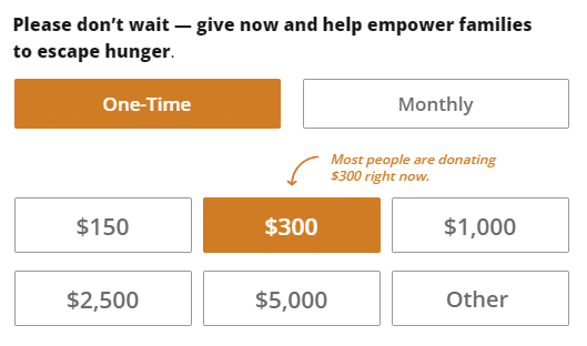
- Offer suggested giving amounts. Suggested giving amounts are buttons that highlight different gift amounts that your supporters can choose from. They help take the guesswork out of the donation process. Essentially, donors want to do the “right thing”—they want to conform to what others are doing. Suggested and highlighted donation amounts give donors more confidence when making their decisions.
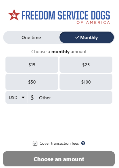
- Feature recurring giving options. Recurring gift options make it easy for supporters to opt into giving on a regular basis. Provide an option on your donation form for supporters to check a box allowing them to donate monthly.
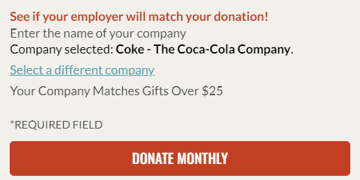
- Make it easy to submit matching gifts. Matching gifts are a common corporate philanthropy program, but eligible donors are often unaware of their eligibility. Include a matching gift database on your organization’s confirmation page and invite donors to search to see if they’re eligible for a match from their employer.
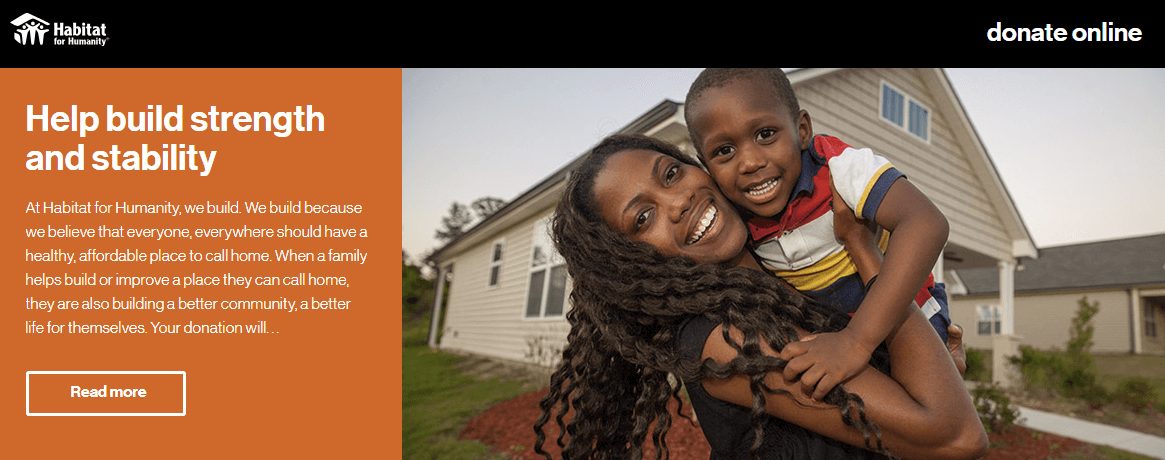
- Choose compelling images. The human brain can process visuals in as little as 13 milliseconds, making images a compelling way to convey the emotional impact of donations very quickly. Featuring just one central image on your donation page can be a persuasive way to show donors who their gifts support. Take a look at the Habitat for Humanity donation page as an example:
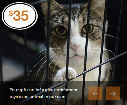
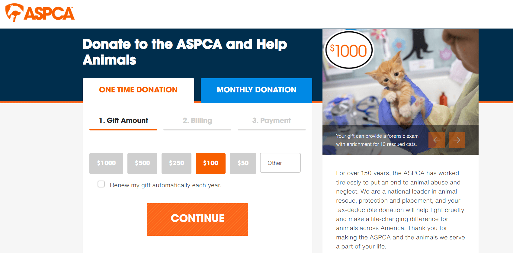
- Connect donations to impact. Showing potential donors the specific, tangible impact they can make on your mission inspires them to keep giving. An effective way to do this is by connecting donation amounts to specific positive actions. For example, the ASPCA donation page features a carousel of images of animals along with specific donation amounts and the positive impact that those donations can help the organization achieve.
- Improve page load speed. According to Google research, the likelihood that a visitor will bounce increases by 32% as page load time lengthens from one second to three seconds. Maintaining a low bounce rate for your donation page is essential to keeping donors on the page and driving more conversions. Compress images, reduce unused code, and deploy lazy loading to decrease your donation page’s load speed.
- Use a secure payment processor. To maintain audience trust, ensure the payment processor you use keeps donors’ information secure. Choose a tool that offers features like PCI compliance or certification, data encryption, and fraud detection.
- Make your donation page accessible. Accessibility is the process of designing your website in a way that is usable and understandable by everyone. Nonprofits that receive federal funding are required to comply with ADA-accessible website requirements. Maintain compliance by following the Web Content Accessibility Guidelines, which include regulations for using sufficient color contrast between the foreground text and the background, incorporating alternative text for images, and ensuring that form fields have descriptive labels.
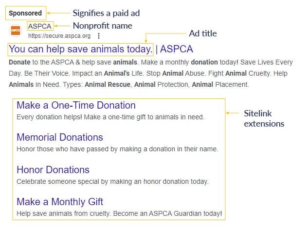
- Promote your donation page via Google Ads. Google Ads are the sponsored ads that appear at the top of search results. These ads are an effective opportunity to promote your donation page to an audience of potential new supporters browsing for terms relevant to your nonprofit. Plus, as a nonprofit, you could be eligible for the Google Ad Grant Program, which offers nonprofits $10,000 per month in Google Ad spending. For example, here is a sponsored ad from the ASPCA that appears after searching the term “donate to animal shelter”:
- Offer donors the option to send an eCard. An eCard is a digital greeting card sent via email. Offer donors the option to access free eCards after donating or to send an eCard to notify a loved one that they donated in their honor. For example, Habitat for Humanity South Africa created a Christmas campaign with the option for donors to give a tribute gift and send an eCard:

- Ensure your donation page is easy to find and accessible at all times so that those who feel inspired to give can do so with just a few clicks. Include a donation button anywhere donors might feel the highest motivation to contribute. For example, you can include a donation CTA in your website’s header, within blog posts, and on other marketing channels, such as social media posts or email newsletters.

12 best nonprofit donation page examples for inspiration
Exploring what these best practices look like in action can help your nonprofit gather inspiration and direction for designing your giving form. Take a look at some of the best donation pages and what makes them so effective for driving fundraising and supporter engagement:
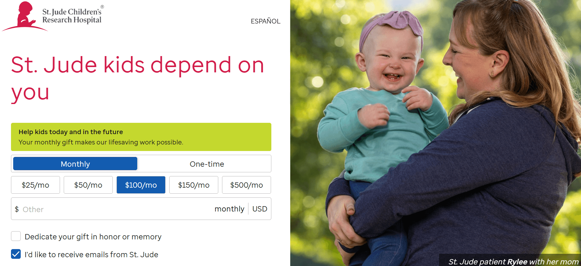
1. St. Jude
The St. Jude donation page emphasizes the organization’s credibility at every step. Frequently asked questions help donors learn more about the giving process to increase their confidence. Accreditations from Charity Navigator and the BBB demonstrate that the organization has been vetted by a reliable third party.
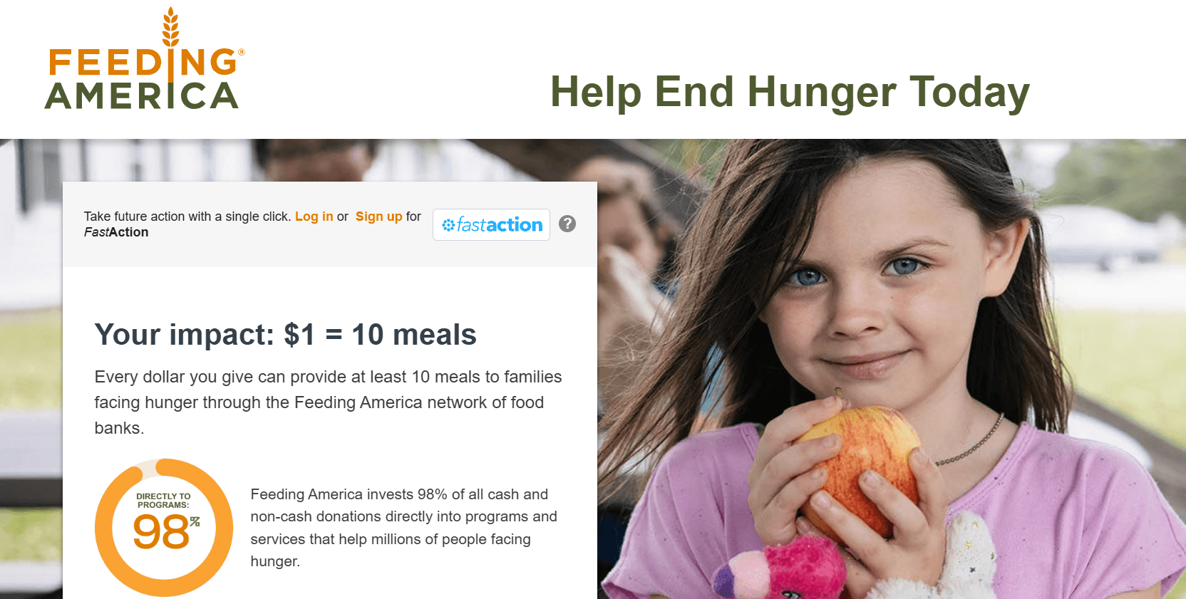
2. Feeding America
Feeding America’s giving page prioritizes impact. Donors can see the direct positive effect that a single dollar can have on people in need. Plus, the statement that they invest 98% of donations directly into mission-critical programs and services reassures donors that their investment in the organization is a smart one.
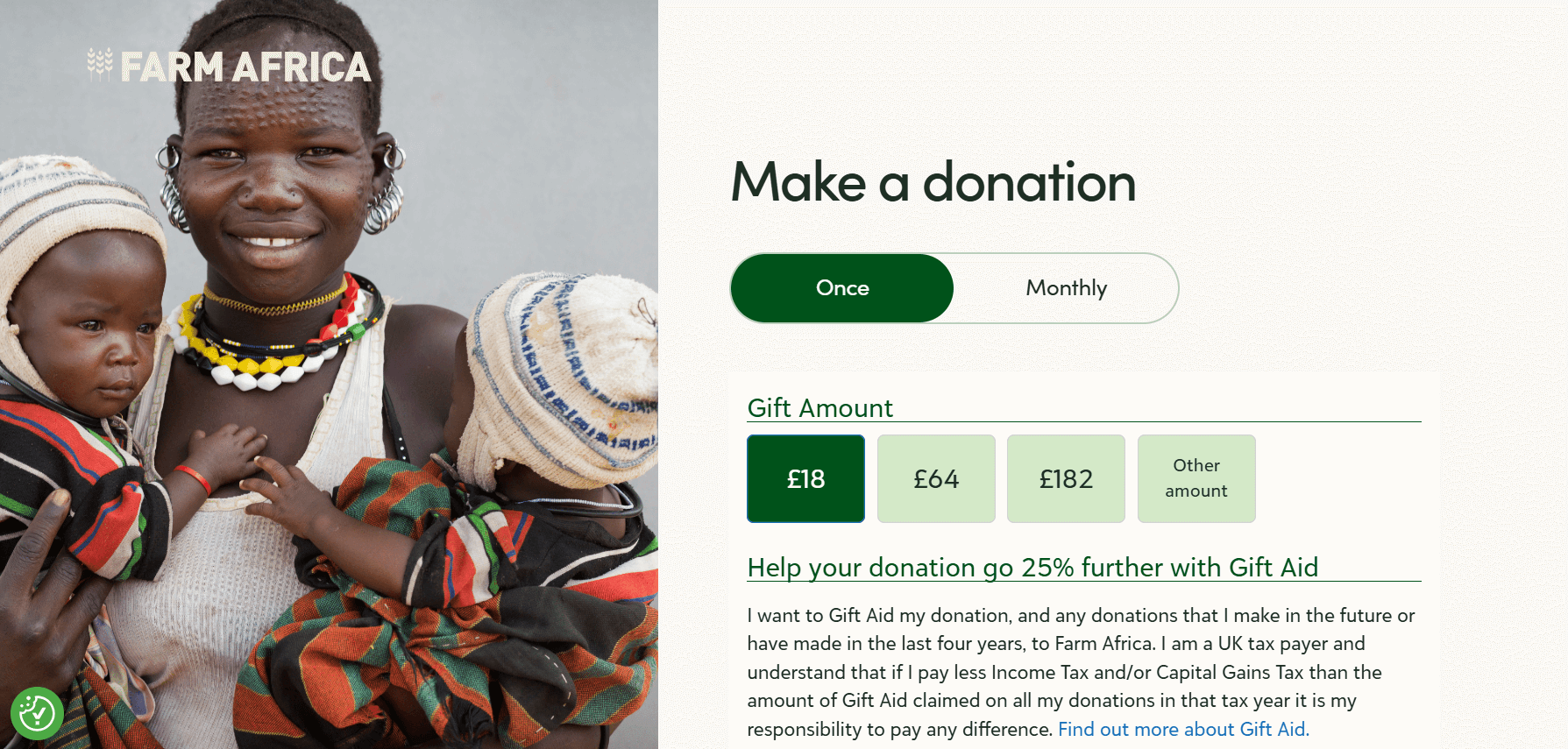
3. Farm Africa
The branding and imagery of the Farm Africa donation page leave a powerful impression. A single, eye-catching hero image dominates the left side of the page, allowing donors to form an emotional connection with the organization’s beneficiaries. The page’s design is simple and effective, with a straightforward form and tasteful incorporation of green tones from the brand’s color palette.
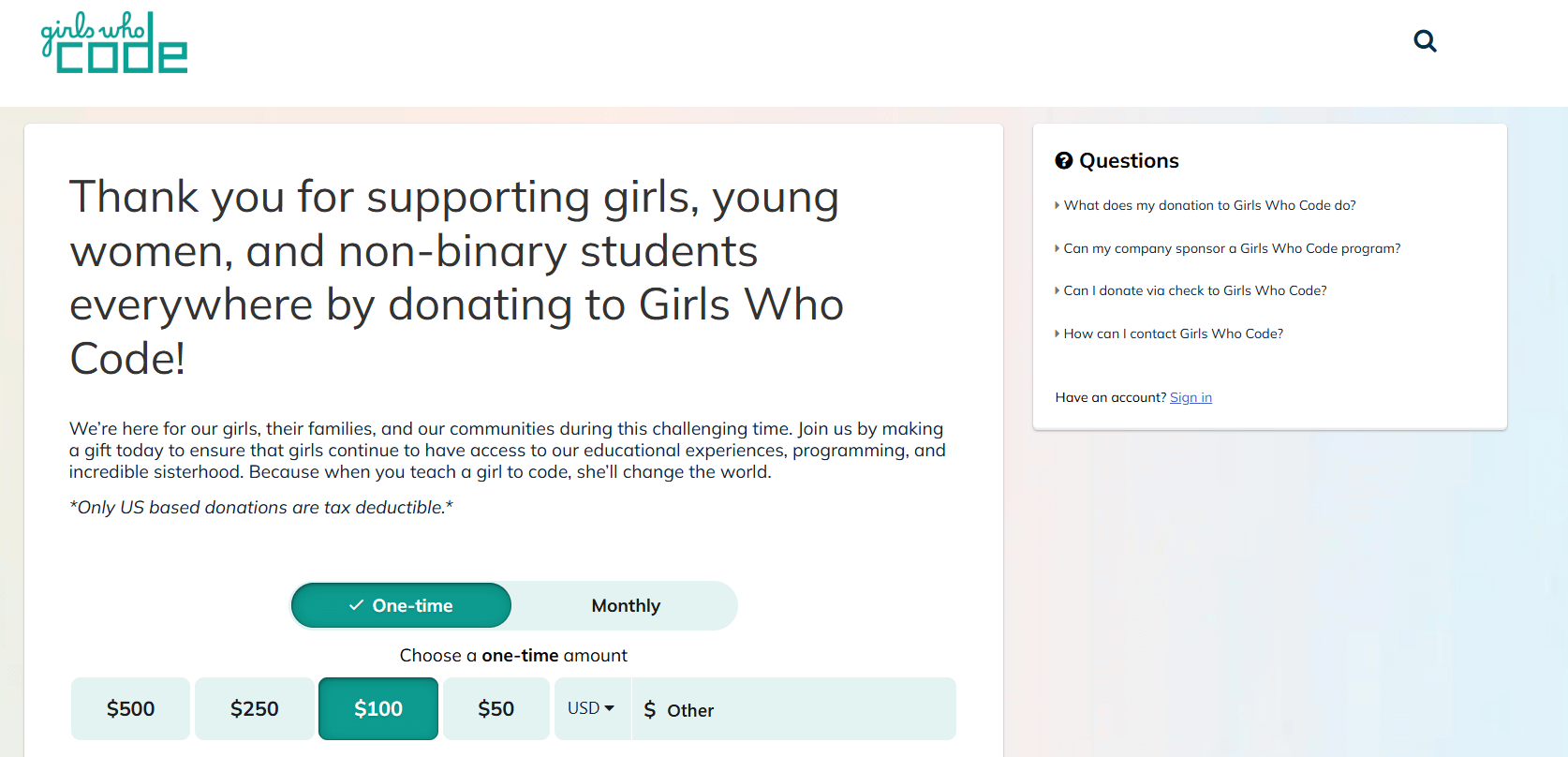
4. Girls Who Code
The Girls Who Code donation page keeps things simple, with a streamlined form. The page includes a quick case for support at the top, along with a few frequently asked questions to increase donors’ confidence. The form is uncluttered and simple to use, whether on a laptop, tablet, or mobile device.
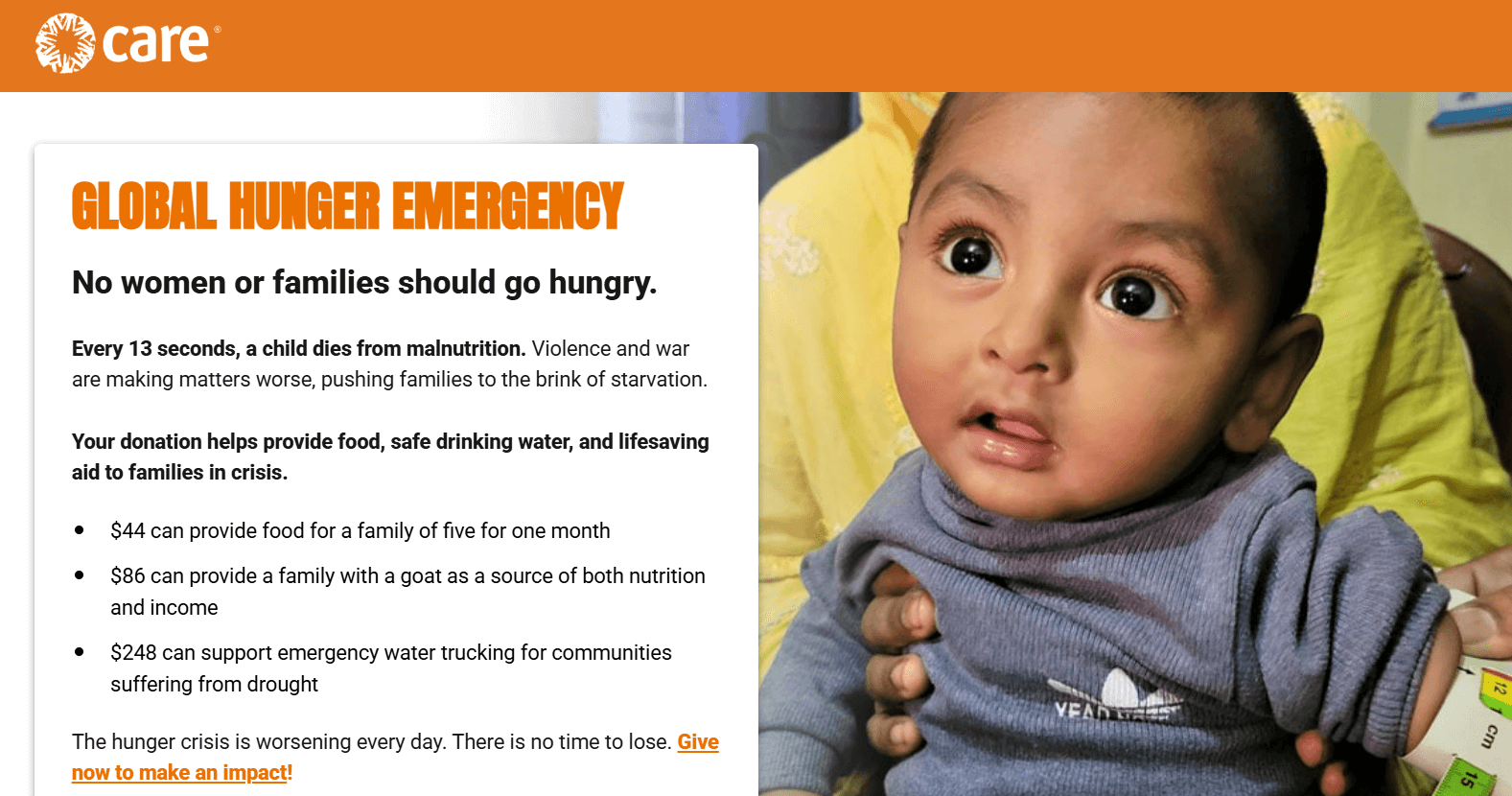
5. CARE
The CARE giving form presents a robust case for support. The bold text at the top that says “GLOBAL HUNGER EMERGENCY” immediately catches donors’ attention and demonstrates the urgency of giving now. The page also highlights the impact of multiple donation amounts, showing donors how their gifts can make a difference for those in need:
- $44 can provide food for a family of five for one month
- $86 can provide a family with a goat as a source of both nutrition and income
- $248 can support emergency water trucking for communities suffering from drought
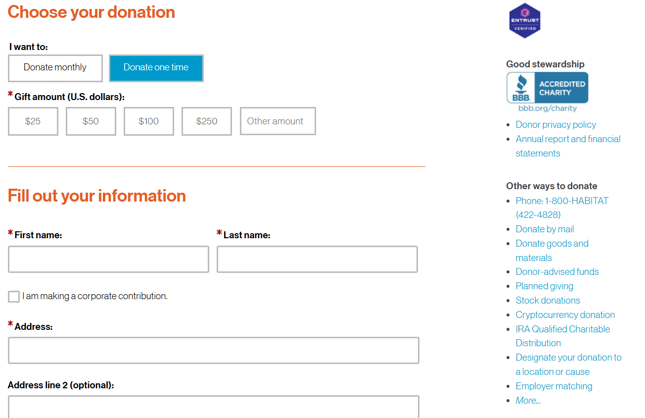
6. Habitat for Humanity
The Habitat for Humanity giving form not only allows donors to contribute immediately online but also spotlights a variety of other giving avenues supporters may be interested in. These opportunities include donating goods or services, stock donations, donor-advised funds (DAFs), cryptocurrency, and more. As a result, donors can contribute in the ways that are most appropriate for their philanthropic goals and giving capacities.
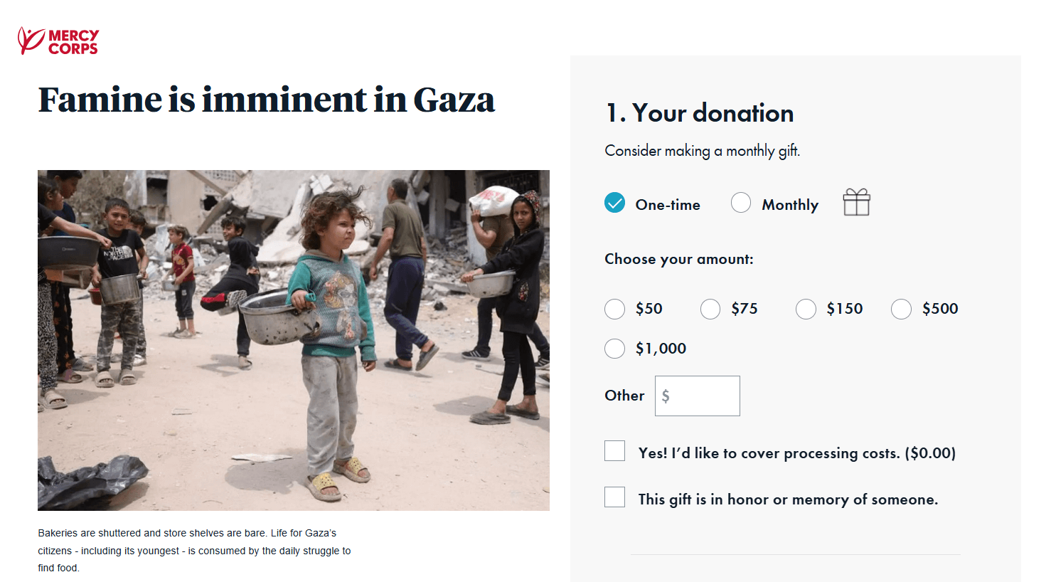
7. Mercy Corps
A study of nonprofit transparency found that “organizations that went from not being transparent to being transparent saw an increase of 53 percent in total contributions, one year later.” The Mercy Corps donation page does an excellent job of offering transparency to its supporters by providing efficiency statistics, such as showing that the organization spent 86% of its resources on programs that help people in need.
8. The ASPCA
The ASPCA donation form offers a rotating carousel of images that tie donations to impact. For example, a $50 donation can pay for an animal’s foster supplies for one month. The donation page features a straightforward three-step process, which includes separate pages for selecting the donation amount, entering billing information, and providing payment details. This structure simplifies the giving experience, helping donors avoid a lengthy page filled with numerous form fields that can feel overwhelming.
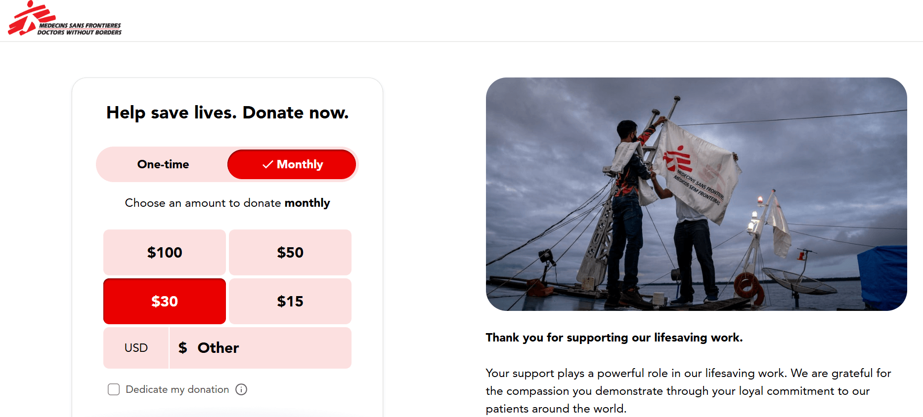
9. Doctors Without Borders
The Doctors Without Borders giving page leads with a message of gratitude for donors. Donor appreciation is essential throughout every stage of the giving process. A study examining the effects of donor gratitude found that sending brief thank-you messages to supporters after they engage with your organization—but before they become donors—can double the likelihood that they will donate in the future.
That’s why including the message “Thank you for supporting our lifesaving work” is a smart move for Doctors Without Borders—it can give supporters who may be on the fence about donating a sense of goodwill that drives them to complete a gift.
10. The Malala Fund
The Malala Fund donation page is robust yet straightforward. It includes everything donors need to know—the organization’s approach, donors’ impact, more ways to give, and FAQs—without overwhelming supporters with too much information. As a result, supporters can feel empowered knowing that their gifts will go directly toward girls’ education worldwide.
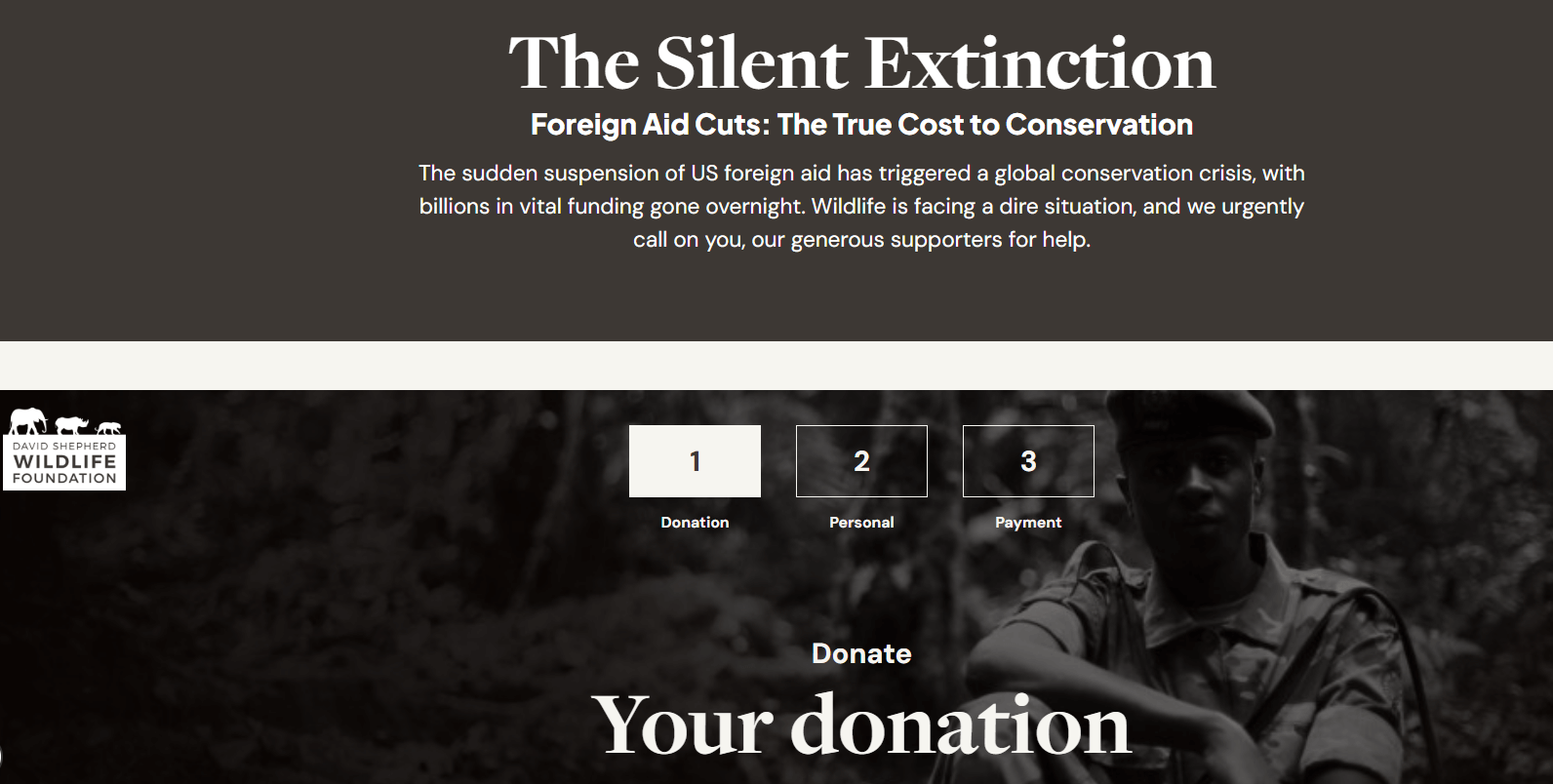
11. David Shephard Wildlife Foundation
The David Shephard Wildlife Foundation donation form features a bold look, with dark, moody images that convey the gravity of the conservation crisis. The form takes a very stripped-down approach that keeps the focus solely on online giving. Donors have a brief case for support and impact information, which helps contribute to their motivation to give without inundating them.
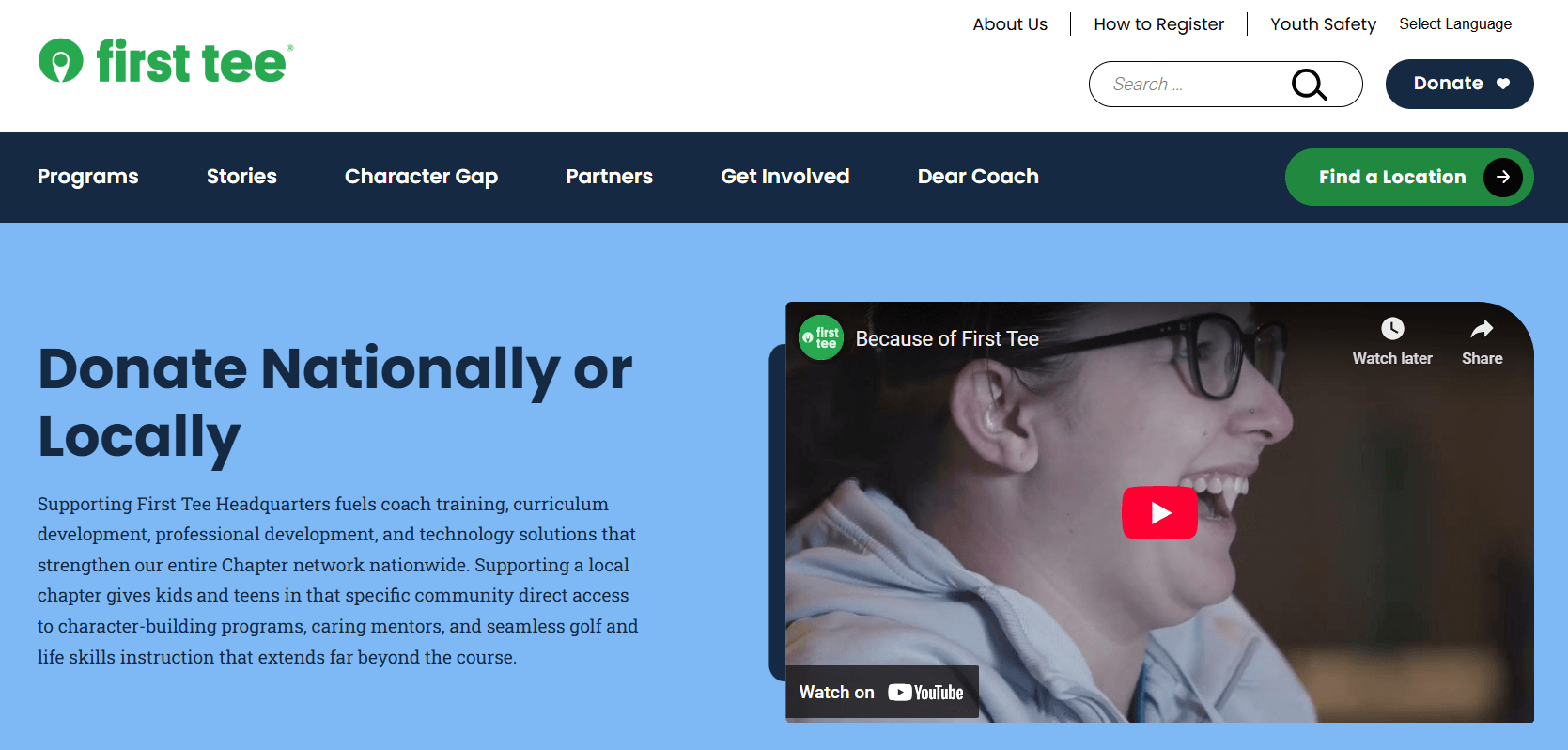
12. First Tee
Studies have shown that donors who watch fundraising videos from a nonprofit are 48% more likely to donate. The First Tee giving page includes a top-of-page video for donors to understand the positive difference the organization makes for children and teens. Adding this option is an effective way to engage donors who might respond better to videos than written content.
How Qgiv + Bloomerang helps build high-converting donation pages
Qgiv + Bloomerang offers an intuitive, integrated suite of fundraising tools designed to help nonprofits maximize the impact of their efforts. Our solutions help you raise more with less stress and attract new donors to your cause.
Nonprofits love to use our solutions to create customized, intuitive, and high-converting donation forms. Our donation pages feature the following elements:
- Custom branding and personalization
- Multiple payment methods (credit cards, Apple Pay, PayPal, Venmo, Google Pay, and Express Donate)
- AI-powered suggested giving amounts
- Timely recurring giving prompts
- Flexible giving
- Abandoned gift reminders
- Matching gift prompts
- Built-in fraud detection
With these robust tools, our customers see real results. Our fundraising software helps them:
- Convert 55% more donations through Express Donate.
- Grow donation sizes by 37%.
- Recover 5% of abandoned gifts with the help of abandoned gift reminders.
The bottom line
Donation pages are essential tools in the nonprofit world. They allow organizations like yours to collect gifts online and provide supporters with an easy way to get involved with your mission.
Don’t forget: When supporters submit their contributions on your well-designed donation page, that’s only the beginning. Continue reaching out, stewarding them, and building impactful relationships.
For more information to help optimize your online fundraising campaigns, check out these additional resources:
- 20 Fundraising Platforms to Supercharge Donations in 2025. Explore the best online fundraising solutions to find the right option for your organization.
- What is Donor Management Software? 11 Best Options for 2025. Donor management software can keep your donor information organized and secure—review the top choices in this guide.
- 8 Best Nonprofit Credit Card Processing Platforms for 2025. A secure payment processor is critical for online giving. Gain insight into the available options here.