Kindful Gets a Facelift: Product Updates You’ll Love

Clarity is the first and most important job of any interface.
Kindful recently got a total facelift, as team members updated the user interface, page titles, navigation elements, and tons more. We’re really proud of the improvements. It’s like we’ve finally reached the end of that wonderful stage of puberty, moving on from zits and cracked voices to voting and road trips.
Daniel, one of Kindful’s Product Owners, lead the charge for the new Kindful. “The 2.1 UI release is the foundation on which we will build the new Kindful,” Daniel comments about the updates. “This is the first of many more updates helping users understand our interface easier and faster.”
All the small things
We updated a variety of details and designs to give an overall boost to the Kindful interface. You’ll still recognize the wonderful app you’re used to, but the small things add up to create one beautiful update.
For starters, the nav bar on the left got a bit of a makeover. We tightened things up, took out the icons that were there, and made the Add New button, well…an actual button.
The second navigational piece we changed was how we titled things. If you look through any app (especially a fundraising and CRM platform), there are an unbelievable amount of pages. You can go to the Reports page, but within that page are existing templates, scheduled reports, column sets for your reports – and all these individual facets of the Reports page have their own pages. As you can imagine, they stack up pretty quick.
Daniel (and over 20 other Kindful-ites) went through the entire Kindful app and took inventory every possible page. It sounds intense ‘cause it is.
For every page inside the app, we ironed out consistency in how different actions are labeled, how subtitles look if a page needs some help text, and even gave breadcrumbs, so users can see the path they go down when choosing different pages (e.g. Reports > Scheduled Reports > New Scheduled Report).
Back to the topic of clarity: this provides an extreme amount of clarity and context when you’re in the app. Simply put: all this effort is to help you know where you are and what you’re doin’!
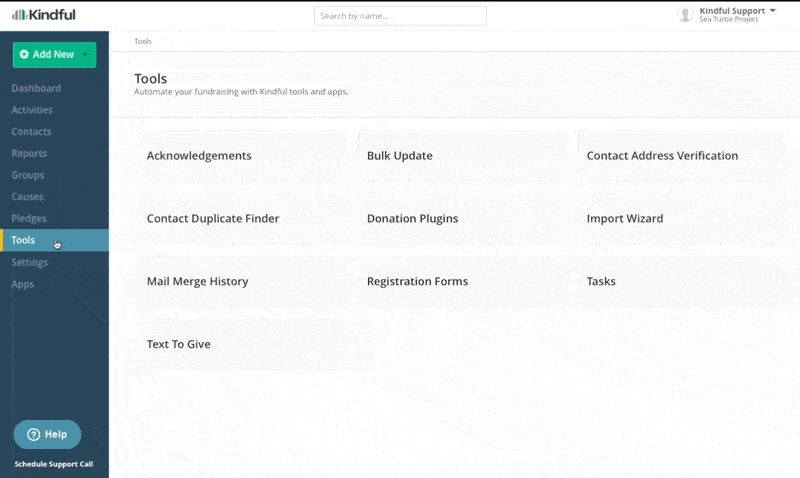
Kindful’s Tools and Settings pages also got restructured, now offering a landing page with different sections within Tools and Settings. This not only provides navigational context, but also ease of use when it comes to accessing these sections on a phone or tablet.
The true beneficiaries: you!
While we all nerd out about cool updates for our software (again, ‘cause we’re nerds), we ultimately do it for you, the organizations that are using the platform to grow their nonprofit. We’re excited to see our users – nonprofit team members and volunteers – get even more out of Kindful because of these updates, making it even easier to understand and efficient to use.
We hope you love the heck out of the new look and are able to maximize your efforts to new heights. And feel free to reach out – we love hearing the feedback of our customers. Until then, thanks for letting us partner with you in changing the world.
P.S. If you’re nerdy (like us)
If you really like reading detailed update lists, we provided all the specifics below. Type-A people, unite!
Alert: The following may incite extra techy nerdiness. Please watch a Tom Hanks movie or listen to Billy Joel after reading to normalize yourself.
The 2.1 UI Release
Updated Settings & Tools Landing Pages to a mobile-responsive grid
- Reports: removed from Tools, moved to left nav
- Causes: removed from Tools, moved to left nav
- Snailers are now “Email/Letter Templates”
- Acknowledgments design/labeling overhaul
- Table design
- Acknowledgments are now Acknowledgement Lists
Added navigation Breadcrumbs to every page
Improved discoverability of the “Add New” button
- Now a distinct button
- New Contact is now “Contact”
- Batch Transactions is now “Transaction Batch”
Simplified and made better use of space in the left nav bar
- Removed icons
- Width is now fixed (doesn’t collapse or expand) for a more consistent experience and better mobile device viewing
- Left nav updated: Org dashboard, Donor Dashboard, Partner Dashboard (all environments: Prod, Sandbox & Playground)
- Updated left nav UX on mobile
Page Titles
- Every page now has a title, and most have subtitles to provide more context to the user
- Page can scroll vertically if necessary, and if so, the title scrolls up underneath the breadcrumbs
Many other small bug and usability fixes.
Schedule a live demo with Bloomerang, and we’ll show you how easy it is to create and automate reports, utilize online and offline fundraising tools, quickly integrate and access all your data, and ultimately create more time to engage your donors.