10 Best Practices For Your Giving Tuesday Website

At Squarespace, we’re proud to have made the process of designing and creating a nonprofit website easier than ever, but there are still a few tips and tricks that we want to share to ensure that your nonprofit’s site is as stunning and impactful as its goals.
With Giving Tuesday inching ever closer, putting together a great Giving Tuesday website, whether it’s a simple landing page or a full-fledged site may seem like a daunting task. But if you take these 10 steps over the next few weeks, we believe you’ll have a digital identity to be proud of.
Here are a few things that you can do to ensure that your presence stands out in the crowd.
1. Have a clear objective
It may seem obvious, but knowing what the purpose of your website is before you start building is key to your success. Are you spreading the word about your nonprofit, asking for donations, looking for volunteers, educating, or something else altogether? Spend some time figuring this out, as it will set the tone for the rest of your site.
The general purpose of your website likely won’t change for Giving Tuesday, but you make want to make some edits to accommodate for your specific objectives with your Giving Tuesday campaigns.
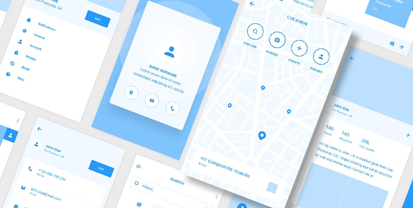
2. Wireframe your site
Wireframing, a term we use to describe sketching out the pages you’ll include in your site and how they relate to one another, can be a huge help before you start building online. Have a clear site architecture in mind so that you know how your audience will get from one page to another.
When making updates to your site for Giving Tuesday, think about your site’s wireframe. How will your Giving Tuesday landing pages relate to your overall site architecture? Will you add a section to your donate page? Will you build out a page to add to your site header? Make sure your Giving Tuesday additions fit within the messaging of your site’s wireframe.
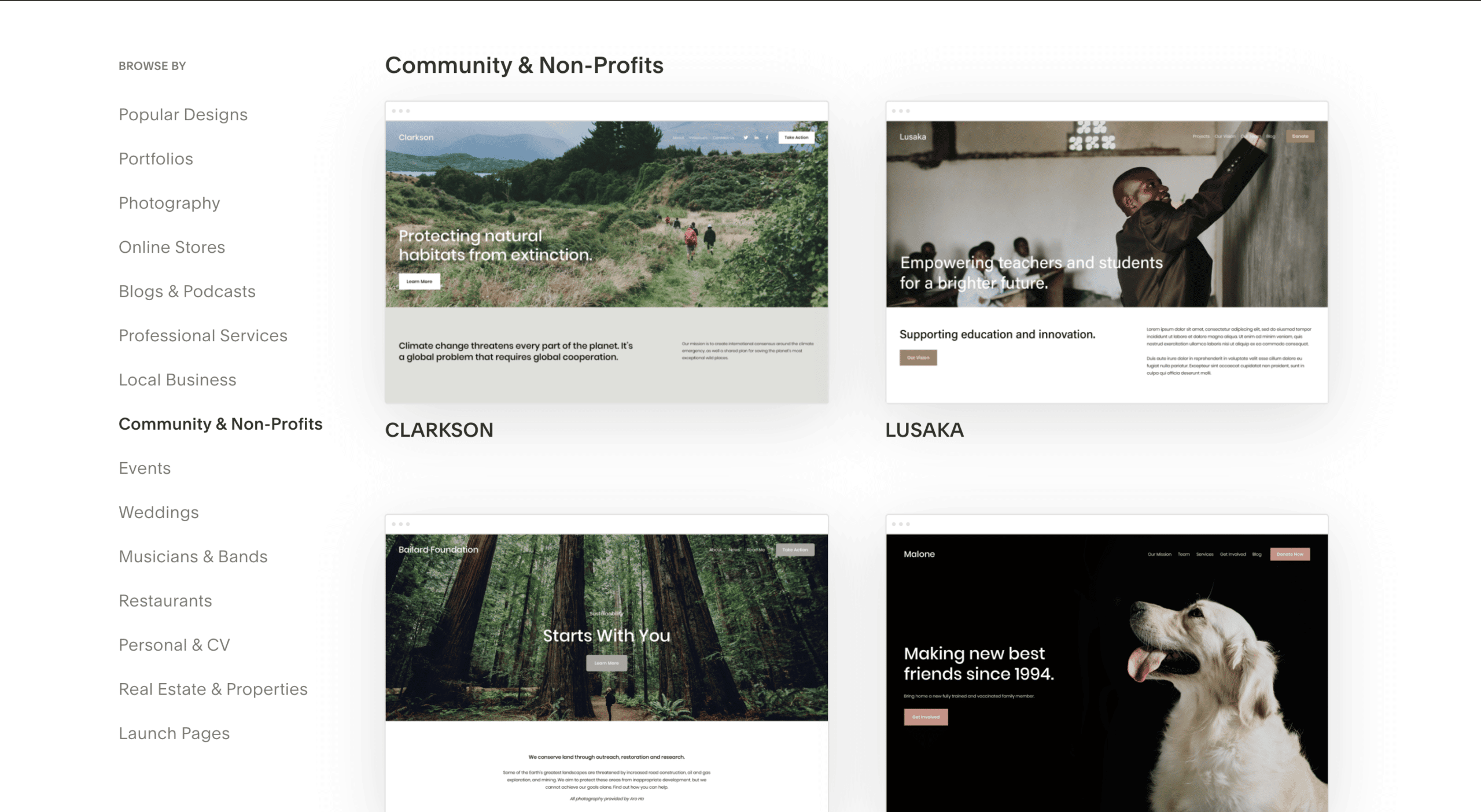
3. Pick a template
When it comes to design, simplicity matters. Many of the most effective websites are clean and sleek, preventing visitors from getting confused. Pick the template that gets the job done in the most straightforward way so your mission is kept front and center.
The great thing about a template is that it’s easy to make additions and updates that are consistent with the overall look of your site. Templates will make it easy for you to make your temporary Giving Tuesday website updates.
4. Have a clear call to action
The best nonprofit websites have clear calls to action. What do you want your audience to do when they visit? Should they be moved to contact you, donate, serve, or otherwise help? Once you’ve decided this for yourself, make sure it’s apparent in your website.
Your site’s call to action likely will not change for Giving Tuesday. But you may want to add secondary calls to action to support your Giving Tuesday campaigns. Most importantly, make sure your donate and subscribe buttons are clearly visible on your website so it’s easy for your new visitors to engage.
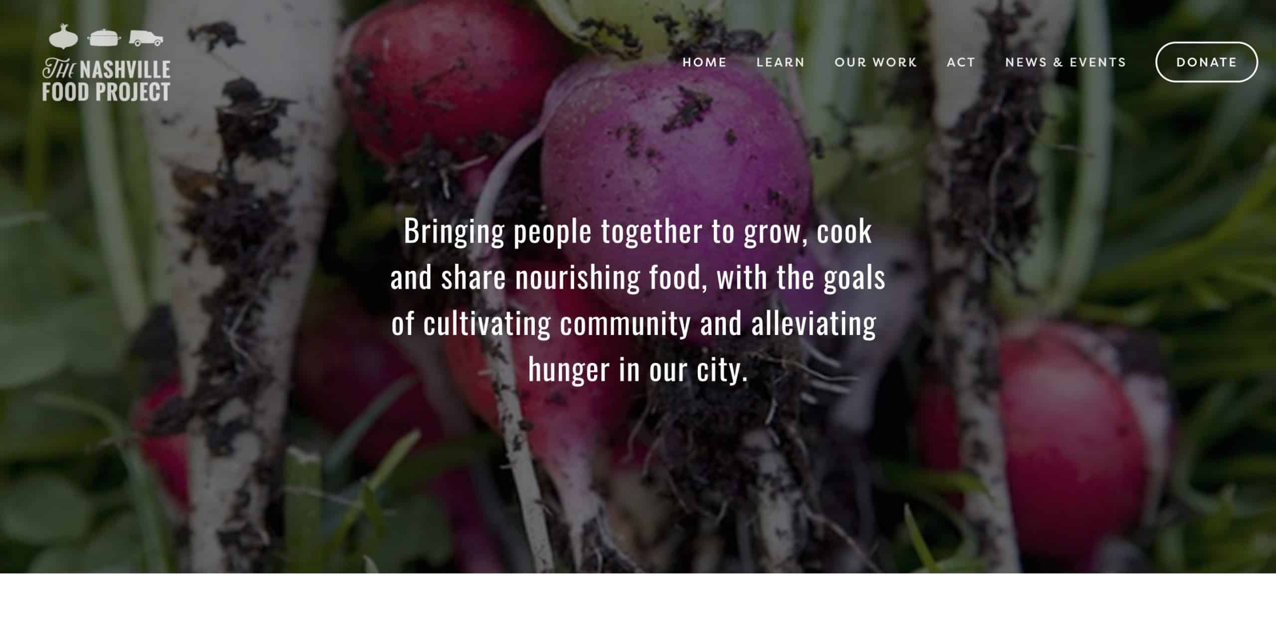
Image: Example of a nonprofit website with a clear call to action.
5. Have great assets
This doesn’t just mean high-resolution photos (though those are important as well). All of your content should look as professional as possible, so make sure your copy is clean and edited, and your images are sharp and crisp. Populate your site with photographs and text that you’re proud of.
Take advantage of the official Giving Tuesday logos to incorporate in your Giving Tuesday assets.
6. Integrate social media icons
Having a Facebook, Twitter, or Instagram button on your site can serve as a call to action. This can be an easy one to implement if your website platform integrates with the most popular social channels. With an increasing proportion people using social media as a major source of news and communication, it’s more important than ever for your nonprofit to have a presence across channels.
Social media is even more important with Giving Tuesday because you’ll want to provide updates to your campaign on your channels. Make sure it’s easy for your website visitors to find and follow you on your social channels.
![]()
Image: Example of a nonprofit website with social icons.
7. Be consistent
Both in terms of style and messaging, make sure that your website maintains a cohesive narrative. That’s why it’s important to choose a website platform that’s customizable so you can easily ensure that you’re keeping the same fonts, colors, and sizes across your pages.
Even though you may be changing some things around for Giving Tuesday, consistency is still important. Your Giving Tuesday website content should be consistent with the the style and messaging of the rest of your site.
8. Be reachable
Make sure that your site allows for two-way communication. Especially when it comes to a nonprofit, it’s key that your supporters have an easy way to get in touch. With Squarespace, for example, you can choose either Mailchimp or Google docs as storage options for newsletters.
At the least, make sure your contact information is visible on the site. Also make sure you take advantage of Google’s knowledge panel by verifying your organization and updating your contact information.
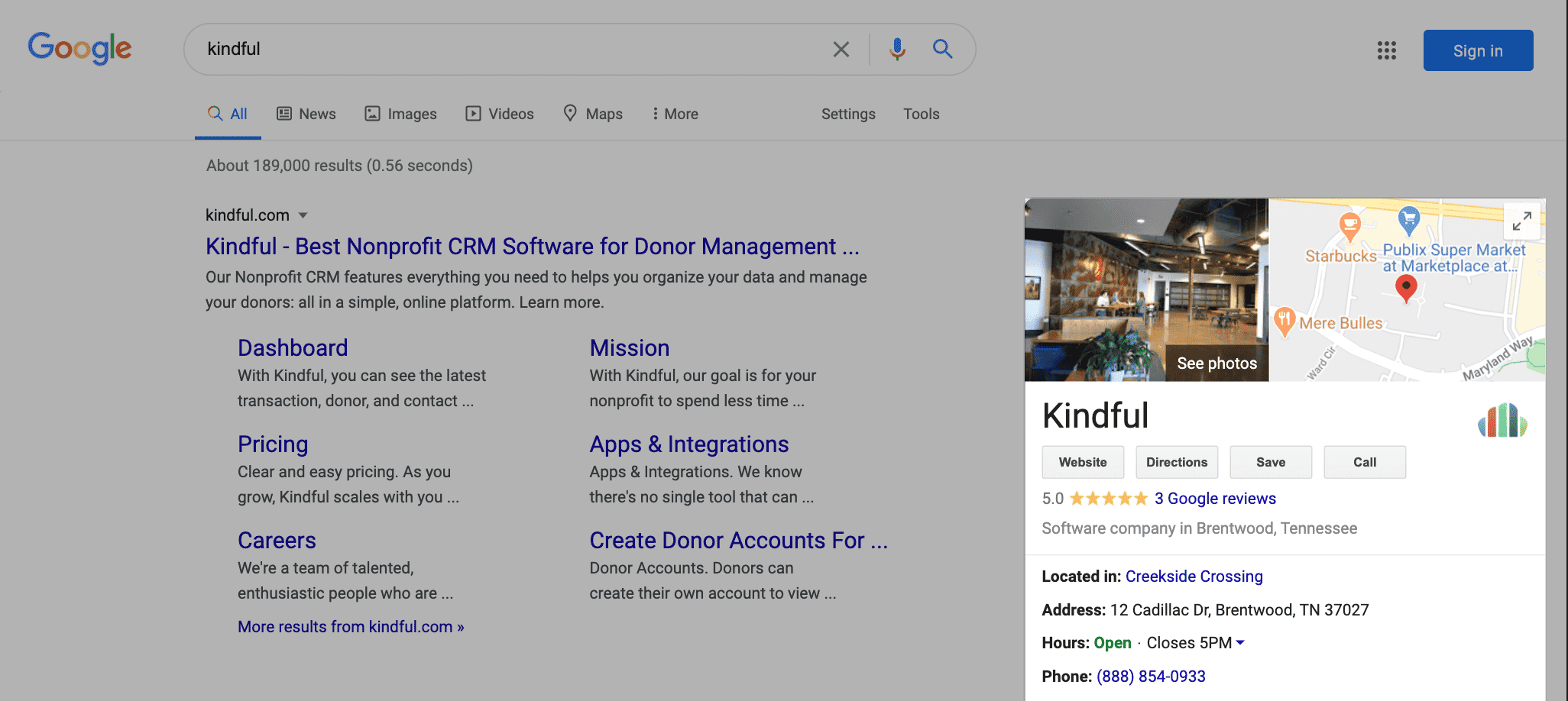
Image: Google’s knowledge panel can help users find contact information for your organization.
9. Keep track of your metrics
It’s important to keep tabs on your visitor numbers and other key data points. See if your website platform has this built-in, or you can consider setting up Google Analytics. Stay informed about who your supporters and interested members are, where they are, and when they’re visiting.
We’d recommend going back to Giving Tuesday from the year before and seeing how your traffic changed. What were the most popular pages? Which pages had the highest conversion rate (number of users who donated or subscribed from that page)? Identify changes in your traffic patterns and then think about how to maximize traffic even more this year.
10. Keep to good SEO practices
Some website platforms already have SEO best practices built in, it doesn’t hurt to go the extra mile. Being discoverable makes your nonprofit all the more likely to achieve its goals, and you can do simple things like ensuring your photos have captions, your pages have page descriptions, and providing as much information as possible for Google search purposes.
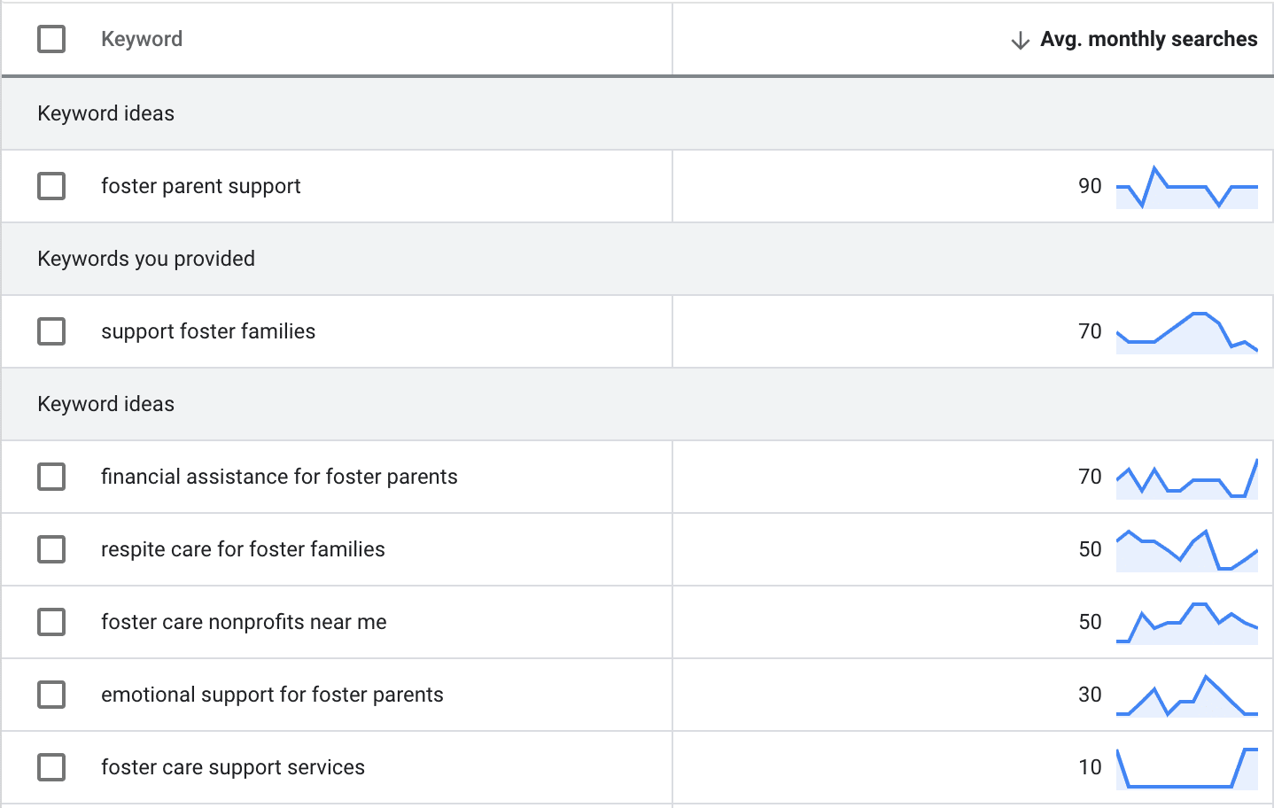
You can take advantage of free tools like Google Trends and your Google Ads account to do some simple keyword research on what potential supporters are searching for in your sector. For example, if you’re a nonprofit that works with foster families, you might research terms like foster parent support, support foster families, and foster care nonprofits near me. This research can help you focus the language of your homepage to make sure it is reaching people who are interested in areas that you serve.
The good news is, if you’ve put in the work to optimize your nonprofit website, then you’ve already laid the groundwork for your Giving Tuesday website. But if your website isn’t where you want it to be, that’s okay too! Giving Tuesday is a great opportunity to get started. Keep these best practices top-of-mind, and watch as your website brings in more donors and supporters this Giving Tuesday.
Schedule a live demo with Bloomerang, and we’ll show you how easy it is to create and automate reports, utilize online and offline fundraising tools, quickly integrate and access all your data, and ultimately create more time to engage your donors.
