Why Landing Pages and Donation Pages Are Both Best

With online giving steadily increasing, it’s now more important than ever to get your online ducks in a row. That means websites, donate buttons, video stories, and yes – donation pages.
Getting this down is pivotal to increasing online fundraising. Donors are looking for very specific information and opportunities. The better you can display everything for them, the easier it will be for them to participate.
While many of us have never even heard of a “landing page” before, we can guarantee that everyone on the internet these days has experienced a landing page.
If you’re in the never-heard-of-it camp, no worries. We’ll explain what a landing page is, how it’s different than a donation page, and best practices for using both.
What Is A Landing Page?
A landing page is a designated web page that a donor can “land on” from a specific campaign. This can include clicking on a paid search ad in Google or a link in your emails. The main idea is that clicking on a link will take someone to this specific page.
A landing page is a place where you include stories, photos, and videos, your offer, and your call-to-action – which should be “donate” 90% of the time. These landing pages are specific to a campaign. While they can include some background information about your nonprofit, their main focus should be on what you want the donor to do (AKA your call-to-action).
Make sure that all the calls-to-action relate to the campaign. If you have a landing page for your capital campaign, all your buttons should correspond to capital campaign donating. If your landing page is to inspire sign-ups for an event, then make sure all the buttons go toward that event’s signup.
The reason for this is two-fold. One, it gives your donors a seamless experience. They don’t want to be searching all over your page to figure out what they came there to do. And two, it’s much easier for your nonprofit to track how each campaign is doing in your database.
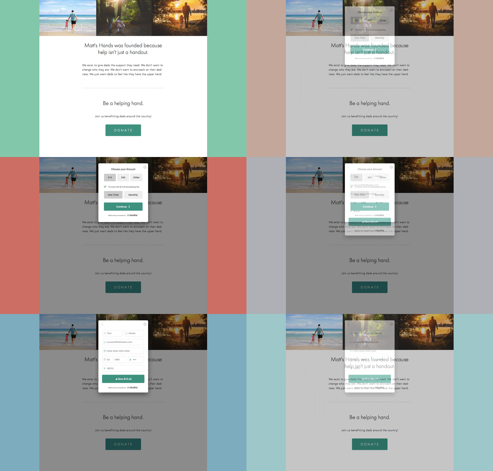
Here’s a quick example from our entirely made-up website, Matt’s Hands.

What Is A Donation Page?
A donation page is a separate page your donors go to after they click on a donate button within your landing page. It’s important that these two pages match in design and branding so your donor knows they’re still on the same site. This page needs very little information. If your landing page was done correctly, they should have all the information concerning why they’re giving to your nonprofit. There should be very few distractions.
The key things your donation page needs are 1) the offer, 2) the impact the gift will have, and 3) the suggested ask amounts. For example, “Your gift of $25 will provide a child with a book this Christmas.”
You can also make the gift amounts dynamic based on their previous giving. Let’s say someone last gave $50 to your organization. It wouldn’t make sense for you to ask them for a $5 donation, but it would make sense to ask them for a $50-$75 donation.
Tip: To do this, create groups in your database based on gift range. Decide how you’d like to break up your ask amounts (low, medium, high) and then create donation pages with those gift amounts pre-populated. Then, you can send emails with targeted ask amounts related to that group’s previous giving. E.g. Send an email to high amount donors, and link the button in the email to a donation page with high amounts suggested.
Can Landing Pages And Donation Pages Ever Be The Same?
Yes! A landing page can become a donation page when the donor doesn’t have to leave the page to make a donation.
Potential donors want to learn as much as they can about your organization before making a donation. Give them all the information they need and give them a place to donate.
Taking a step further, you can place donate buttons strategically around your landing page that pop up right on the page, keeping the donor on your site.
If you have a powerful video testimony from someone who has been impacted, put a donate button right after their story. This way when donors feel compelled to give, the option is right there.

Three Tips For Success
While there are great tips out there on creating landing pages, we have a few steps for you to move forward and get started.
- Take Inventory Of The Pages You Already Have On Your Website
Some of them might be great landing pages already and just need to be supplemented with some donate buttons or specifically placed links to donation pages. - Try Making Your Own Landing Page
Think about which campaign you want to direct people toward and build messaging on this page around that goal. Think about everything someone would want to know about before giving. Put yourself in their shoes to think about where they may feel inspired to click a donate button. - Test Out A Handful Of Methods
We’ll dive deep into testing in our next blog, but if you make a landing page that doesn’t inspire donations, try redesigning it. Or if you place three donate buttons throughout the website but people only click on one of them, try changing the placement of the other two.
Still not sure where to start? Check out the three elements of an effective donation page.
Schedule a live demo with Bloomerang, and we’ll show you how easy it is to create and automate reports, utilize online and offline fundraising tools, quickly integrate and access all your data, and ultimately create more time to engage your donors.