Solutions designed to help nonprofits grow
Bloomerang gathers the best tools, resources, and people in a single place and, through our donor management platform, empowers nonprofit organizations like yours to carry out their missions.

The donor database that thousands of nonprofits trust
Bloomerang is the donor management solution built to deliver a better giving experience and support stable, thriving organizations.

Tend to your donor community.
Strengthen the roots of giving.
Cultivate better outcomes.
Make fundraising easier—for your team and your donors.
The easier your tools are to use, the easier it'll be to grow your mission. Bloomerang helps nonprofits decrease donor attrition and increase revenue. Connect with the donors, volunteers, and partners who will grow your mission.
Collect donations anytime and anywhere.
Raise more funds by creating a seamless giving experience for donors. Expand your fundraising reach by empowering supporters to become effective online fundraisers.
-
 Unlimited donation pages and forms
-
 Peer-to-peer and crowdfunding tools
-
 Dynamic donation button
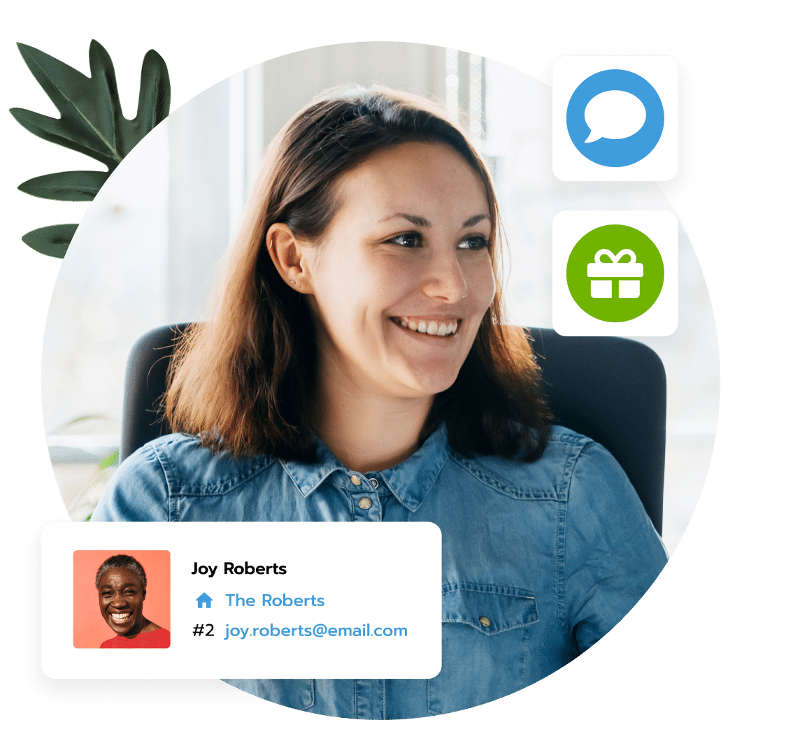
Retain your donor community.
Retaining donors is critical to achieving a thriving fundraising operation. Bloomerang equips you with the tools you need to create relationships that last a lifetime and make a bigger difference.
-
 Full CRM
-
 Interactive dashboard
-
 Data segmentation
-
 Communication workflows and audits

Create stronger connections with your community.
Achieve better fundraising results through tailored communications. Bloomerang’s integrated marketing tools make it easy to send and track timely, personalized emails and mailings.
-
 Email marketing
-
 Letters and mailings
-
 Surveys
-
 Track activity with BCC to Bloomerang
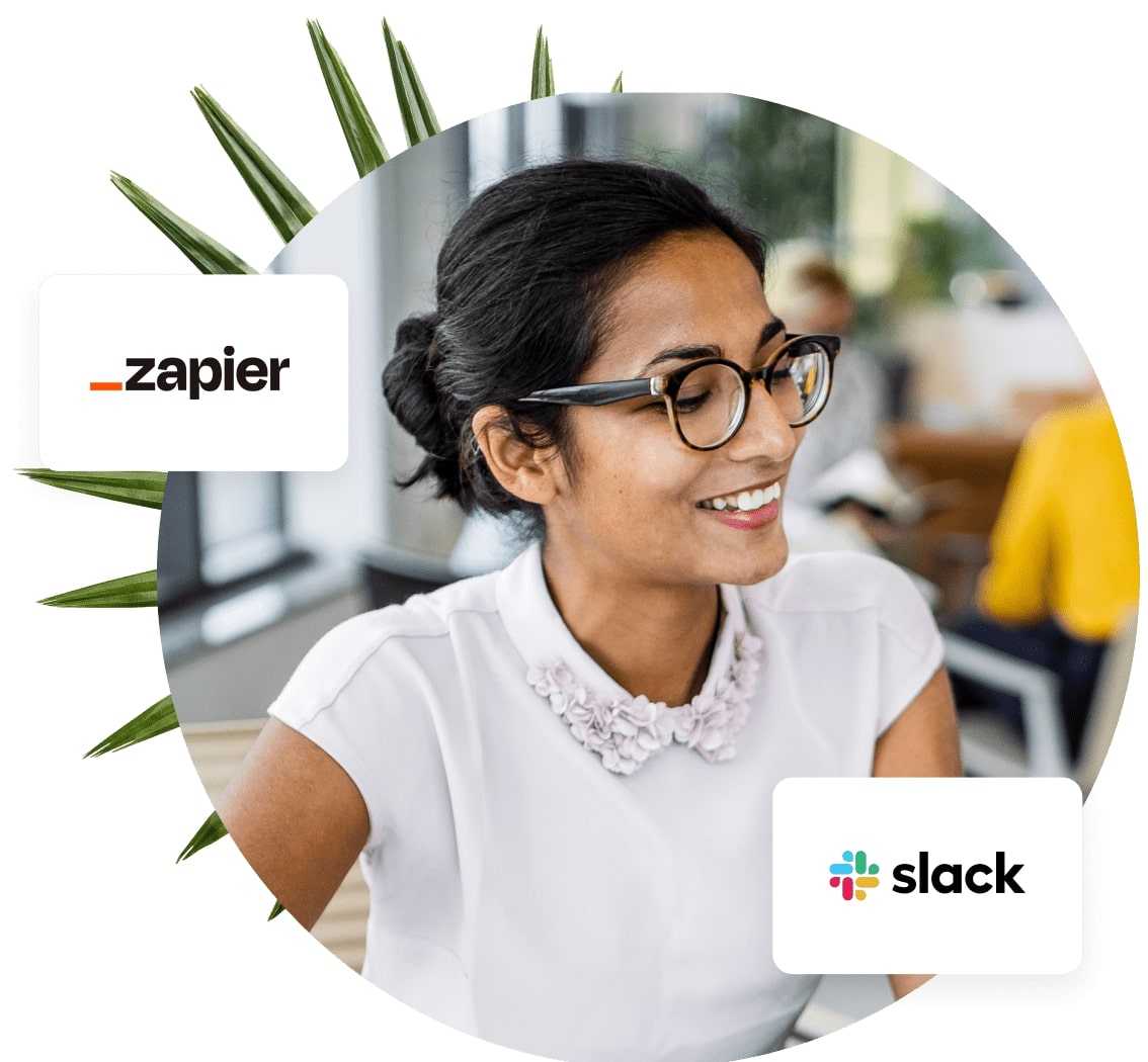
Divided data comes together.
Automatic daily updates save you time and ensure your data freely and accurately flows between the apps you depend on.
-
 Integration hub
-
 Nightly mailing address updates
-
 Task management
-
 Scheduled reports
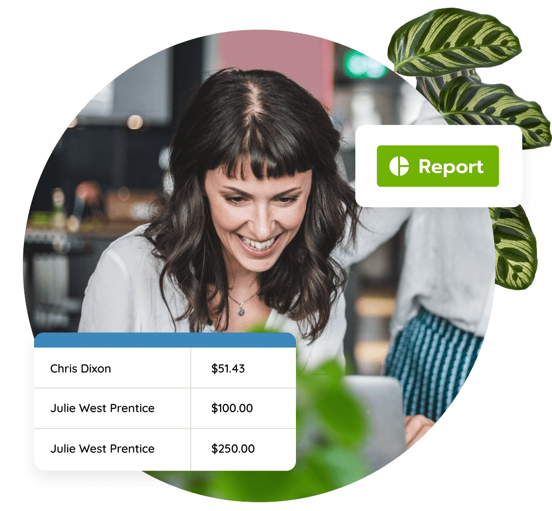
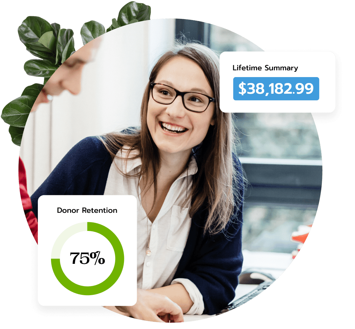
Easily report results.
Save time by prioritizing your campaigns and resources wisely. Generate reports that will help you refine fundraising efforts and discover and grow relationships.
-
 Filter-based reporting
-
 Engagement scoring and wealth screening
-
 Donor retention insights
-
 Email performance analytics
Maximize the Lifetime Value of Your Donor Database
Top fundraising consultants recommend Bloomerang.
“Bloomerang is a game changer for me and for my clients. I’ve used a lot of CRM systems in my career and I keep coming back to the adaptive nature of this software.”

Kishshana Palmer CEO Kishshana & Co.
“If you’re ready for a software that will not only help you manage your donor information, but also your donor relationships, this is it. If I were in the market for software, I’d jump all over Bloomerang!”

Sandy Rees Founder & Chief Encouragement Officer Get Fully Funded
“Fundraising is really ‘Relationship Raising.’ As nonprofits, we want our donors to fall in love with our mission. Bloomerang helps make that happen and simplifies the journey from prospects to donor engagement.”

Tayyab Yunus CEO & Founder Intuitive IT Solutions, Inc.
“My clients love how easy it is to use Bloomerang. I love that they shape the most important goals right into their product, making it ridiculously easy to focus on what matters most.”

Marc A. Pitman CEO The Concord Leadership Group LLC
“Bloomerang incorporates the best practices of fundraising, donor loyalty and constituent engagement into a user-friendly platform that’s priced well for small and growing nonprofits.”

Claire Axelrad Principal Clairification
